Coordinates tab buttons and their corresponding panels.
“the process of navigating a network of information resources” — Wikipedia: Web navigation. This quote supplies general domain context, not an API definition.
Category: Navigation · Availability: Core · Maturity: Stable.
Source: Web Awesome component source (MyST GitHub transformer); official component documentation.
Atomic composition
Reuse: Tab, Tab Panel. The full nested markup below remains independently usable.
Live preview
Static reference (works without JavaScript)
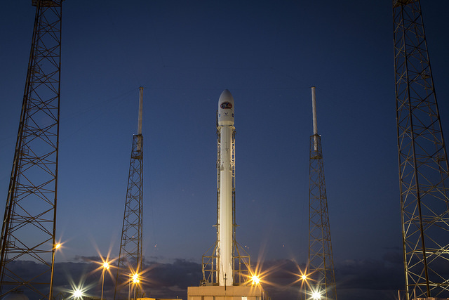
The image and copyable HTML example below remain available if the interactive widget fails to initialize. The widget adds component behavior; it does not provide the only readable content.
Markdown code snippet
Copyable HTML below assumes the consuming application provides the referenced ./images/ files. The live widget above intentionally uses SoftCloud-specific /static/showcase/ assets.
<wa-tab-group active="launch">
  <wa-tab panel="launch">Launch</wa-tab>
  <wa-tab panel="galaxies">Galaxies</wa-tab>
  <wa-tab-panel name="launch">
    <img src="./images/rocket.jpg" alt="Falcon 9 launch">
    <p>Falcon 9 carrying the DSCOVR spacecraft.</p>
  </wa-tab-panel>
  <wa-tab-panel name="galaxies">
    <img src="./images/hubble-deep-field.jpg" alt="Hubble eXtreme Deep Field">
    <p>Distant galaxies captured by Hubble.</p>
  </wa-tab-panel>
</wa-tab-group>
Usage and API notes
Each wa-tab[panel] targets a unique wa-tab-panel[name]. wa-tab-group[active] chooses the initial panel. Actual photographs make switching panels observable. Use the MyST {tab-set} and {tab-item} directives when the task is organizing prose or alternative code listings, and Web Awesome only for application-like tabs.
Image credits: SpaceX / DSCOVR launch photograph (public-domain claim recorded in the media manifest, independent verification pending); NASA / Hubble eXtreme Deep Field (public domain). Showcase media.
Examples: placement and keyboard activation
Use the placement attribute to choose top (default), bottom, start, or end. Set activation="manual" when moving keyboard focus should not immediately switch the active panel; in that mode, arrow keys navigate between tabs and Space/Enter selects the focused tab.
<wa-tab-group active="launch" placement="start" activation="manual">
  <wa-tab panel="launch">Launch</wa-tab>
  <wa-tab panel="gallery">Gallery</wa-tab>
  <wa-tab panel="unavailable" disabled>Unavailable</wa-tab>
  <wa-tab-panel name="launch">
    <img src="./images/rocket.jpg" alt="Falcon 9 launch">
  </wa-tab-panel>
  <wa-tab-panel name="gallery">
    <img src="./images/hubble-deep-field.jpg" alt="Hubble deep field">
  </wa-tab-panel>
  <wa-tab-panel name="unavailable">This panel is disabled.</wa-tab-panel>
</wa-tab-group>
Verified API: Web Awesome 3.14.0
| Attribute / property | Values / default | Usage |
|---|---|---|
active | Name of a panel, default empty | Sets which tab and panel are selected |
placement | top (default), bottom, start, end | Horizontal or vertical tab arrangement |
activation | auto (default), manual | Whether keyboard focus also changes the visible panel |
without-scroll-controls | Boolean, default false | Hides scroll arrow controls if tabs overflow |
| Slot | Accepted content |
|---|---|
| Default | <wa-tab-panel> children |
nav | <wa-tab> children (tabs assign their nav slot automatically) |
| Event | Emission |
|---|---|
wa-tab-show | A tab becomes visible |
wa-tab-hide | A tab is hidden |
The component exposes --indicator-color, --track-color, and --track-width CSS custom properties. Publicly documented parts include tab-group, nav, tabs, body, scroll-button, scroll-button-start, scroll-button-end, and scroll-button__base. The obsolete base part is deprecated. Other documented dependencies include wa-button, wa-icon, wa-spinner, wa-tab and wa-tab-panel.
Portable MyST equivalent
When tabs only separate documentation snippets or language-specific explanations, use the built-in MyST {tab-set} and {tab-item} instead of initializing Web Awesome:
kubectl get pods -Akubectl get nodes -o wideUse Web Awesome tab groups for actual application state, dynamic user interaction, custom placement, or tab-specific events. For source-of-truth API details see upstream version-pinned reference and the official API page. Refer to the SoftCloud authoring guide for the page-standard checklist.